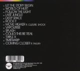
"Sub Focus" (Sub Focus 2009)
Genre
How is the genre of the track/artist evident?
How is the genre of the track/artist evident?
The genre of this artist is Dubstep and Techno and these relates to the album digipack in many ways. Firstly the way the circle has been made, it has been made in a very techno "phyciodelic" way and this represents the techno genre that is attached to this artist. Furthermore this is very conventional of the Dubstep and Techno genres. With "Chase and Status's - No More Idols" album cover being bright yellow.
 The bold, upper case font being used in this is also very conventional of the genre and this is continued in this album cover.
Media Language
The most evident visual technique of this the circle with the colours in the middle. I think that is is very illustrative of the kind of music with the darker parts of the circle representing the more subtle parts of the tracks and the change in colour represents the "Drop" that happens in the music, this could be one of the meanings given to this. Another could be that "Sub Focus" is the colour in a very dark world and his music will help you too come out of the bland world and into the colour that is "Sub Focus". Also the colours could represent the wide range of genres that the artists produces for including Hip-hop and RnB and this could be a marketing for these types of audiences. If we look into this cover at a micro level we can see that the colour is slowly engulfing the whole of the blackness in the circle and this could be due to the fact that the name of "Sub Focus" has penetrated the circle, which could represent the circle of life. The only other colour apart from the ones already mentioned are the white colours of the names of the songs. These are in white which is a complete contrast to the black that engulfs most of the digipak.
Representation
How is the artist represented?
The way that Sub Focus is represented in this album cover is that he is shown as breaking through the circle. This is "Sub Focus's" debut album and the fact his name intersect circle could show how much of a break through year he had in 2009. His star image is built up through the feeling you have towards him breaking the conventions of the circle and stopping the normal flow of the genre's he is attached too. Dyers study of Stars said that a artists should be ordinary yet extraordinary and in this album cover he is shown to be extraordinary by being the one who breaks the circle of life and is bringing colour into peoples life.
Institution and audience
This print text will, most probably, be consumed through Web 2.0 on sites like "Facebook" or "Youtube". This is done through the search of the artist or through advertising of this album cover. This is because the audience it is aimed at 16 - 24 year olds who are the people who use these types of applications. Another place it could be consumed is on "iTunes" or "Spotify" both of which are peices of software which allow you to download and listen to this kind of music which also viewing the cover of the track.

Some very good comments Ali, however I don't understand your references to the artist as I can't see him on the cover?
ReplyDelete